View this notebook on GitHub or run it yourself on Binder!
Visualize Logged Dataframes
rubicon_ml makes it easy to log dataframes and comes with default visualization support, using Dash and Plotly under the hood. Specifically, rubicon_ml leverages Plotly express to provide many robust visualization options.
Setup
Let’s create a project and log a sample dataframe to it so we can visualize it.
[1]:
import os

from rubicon_ml import Rubicon


rubicon = Rubicon(persistence="memory")
project = rubicon.get_or_create_project("Plotting Example")

project
[1]:
<rubicon_ml.client.project.Project at 0x1629cf2e0>
[2]:
import pandas as pd


df = pd.DataFrame.from_records(
    [
        ["Walmart", 514405],
        ["Exxon Mobil", 290212],
        ["Apple", 265595],
        ["Berkshire Hathaway", 247837],
        ["Amazon.com", 232887]
    ],
    columns=["Company", "Revenue (in millions)"]
)

experiment = project.log_experiment()
dataframe = experiment.log_dataframe(df, name="sample revenue df")

dataframe
[2]:
<rubicon_ml.client.dataframe.Dataframe at 0x1629ce170>
Visualizing Dataframes
rubicon_ml.Dataframe.plot exposes plotting functionality to create simple plots like line, bar, or scatter plots and tables. There are even more complex plots available in plotly.express - any can be passed into rubicon_ml for visualization!
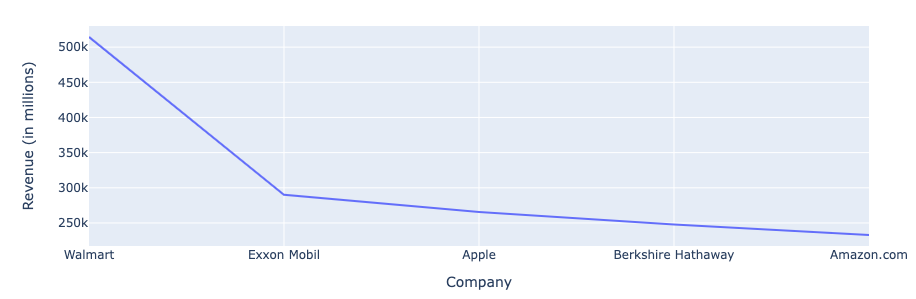
Here we’ll visualize the dataframe with the default line chart (px.line). Any keyword arguments will be passed directly to the underlying Plotly express function.
Note: If you’re viewing this notebook from the
rubicon_mldocs, the plots and widget below are only images since we can’t run a Dash server on GitHub pages. Running locally will produce fully interactive plots!
[3]:
revenue_line = dataframe.plot(x="Company",  y="Revenue (in millions)")

revenue_line
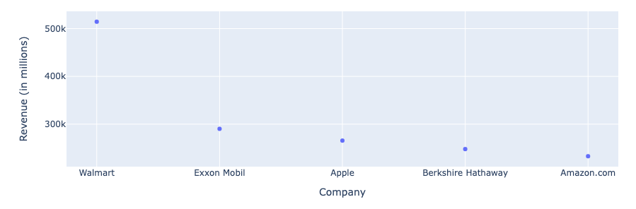
This time we’ll provide px.scatter as the plotting_func argument to generate a scatter plot.
[4]:
import plotly.express as px

revenue_scatter = dataframe.plot(
    plotting_func=px.scatter,
    x="Company",
    y="Revenue (in millions)",
)

revenue_scatter
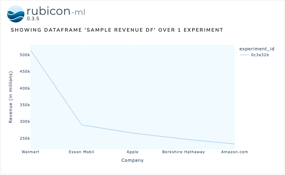
Dataframes can also be visualzied with the dataframe plot widget. For more info the dataframe plot, check out this example. For more info on rubicon_ml’s visualization widgets in general, check out the docs.
[5]:
from rubicon_ml.viz import DataframePlot

DataframePlot(
    experiments=[experiment],
    dataframe_name="sample revenue df",
).show()
Dash is running on http://127.0.0.1:8050/

 * Serving Flask app 'rubicon_ml.viz.base' (lazy loading)
 * Environment: production
   WARNING: This is a development server. Do not use it in a production deployment.
   Use a production WSGI server instead.
 * Debug mode: off