Visualizations
rubicon_ml.viz contains a number of visualization widgets powered by
Dash and Plotly.
Each widget provides a unique UI for exploring and visualizing projects and
experiments stored locally or in S3. The widgets can be compiled into an
interactive dashboard. They can also run in the browser or any iPython
environment like Jupyter Notebook, JupyterLab or JupyterHub. With some
extra work, they could be deployed to a static URL using Docker.

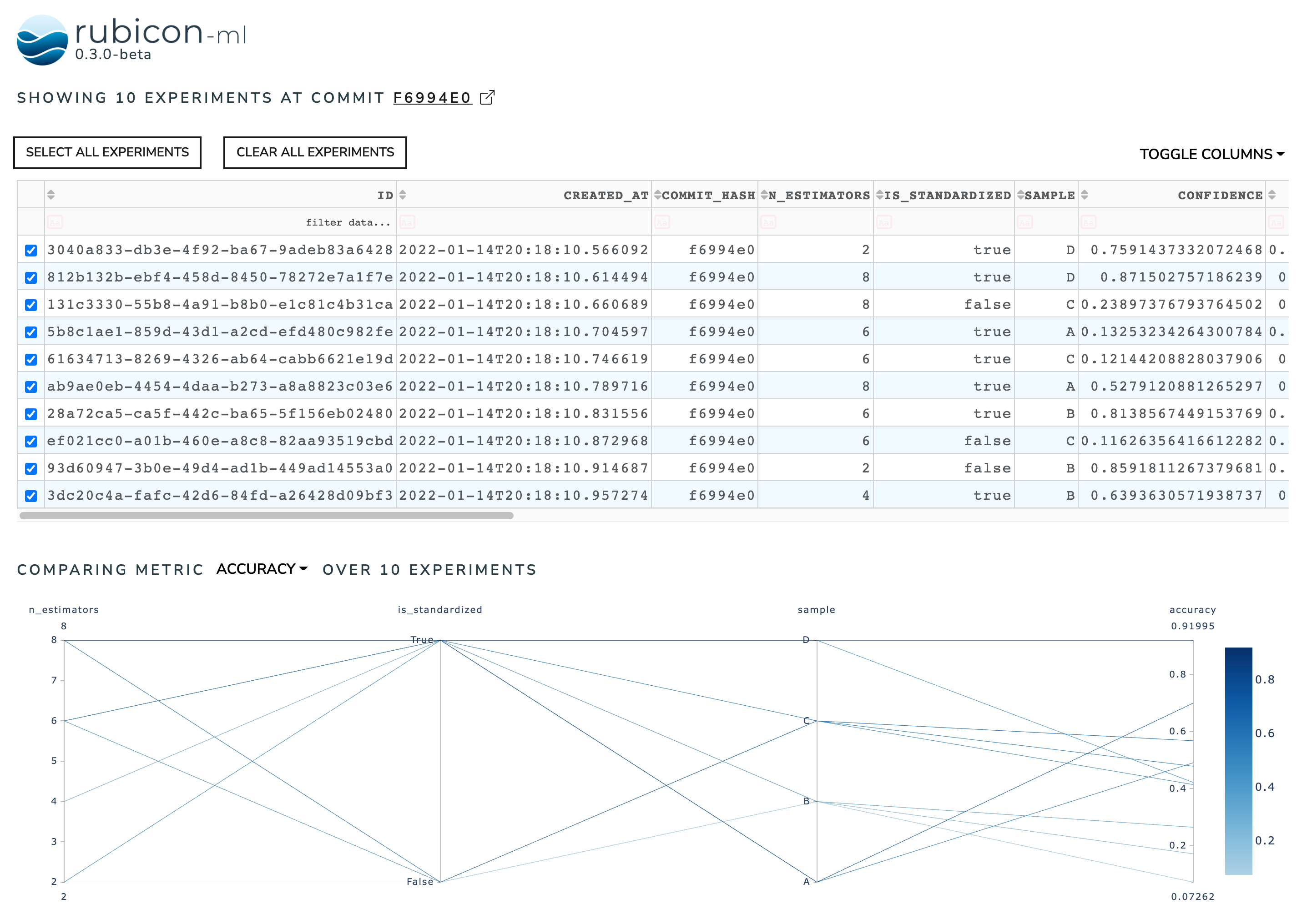
A Dashboard composed of an Experiments Table and a Metric Correlation Plot.
Available Widgets
Dashboarding
The widgets detailed in the examples above can also be compiled into an interactive dashboard.
Basic Usage
Each individual widget can be launched directly from Python code. Widgets will be hosted locally. You can navigate to the provided link in each widgets’ output, or visualize the widget in-line if you are running from a Jupyter environment.
from rubicon_ml.viz import ExperimentsTable

ExperimentsTable(experiments=my_rubicon_project.experiments()).serve()
The above launches the experiments table on localhost:8050 and will run from
any Python interpreter. If you’re working in a Jupyter environment, you can
launch the dashboard inline in a notebook with show:
ExperimentsTable(experiments=my_rubicon_project.experiments()).show()
If you need to configure the Dash proxy, that can also be done with a few extra parameters:
dash_kwargs = {
    "requests_pathname_prefix": "/proxy/8050",
}
run_server_kwargs = {
    "proxy": "http://127.0.0.1:8050::https://my-jupyterhub-server.com/",
}

ExperimentsTable(experiments=my_rubicon_project.experiments()).serve(
    dash_kwargs=dash_options,
    run_server_kwargs=run_server_kwargs,
)
More info on configuring proxies and additional dash_kwargs can be found in the
Dash API Reference.
CLI
The rubicon_ml CLI can lauch a dashboard containing an Experiments
Table stacked on top of a Metric Correlation Plot, as shown in the
figure above.
rubicon_ml ui --root-dir /rubicon-root --project-name "My Cool Project"
Use the --help flag for full usage details:
rubicon_ml ui --help