View this notebook on GitHub or run it yourself on Binder!
Dataframe Plot
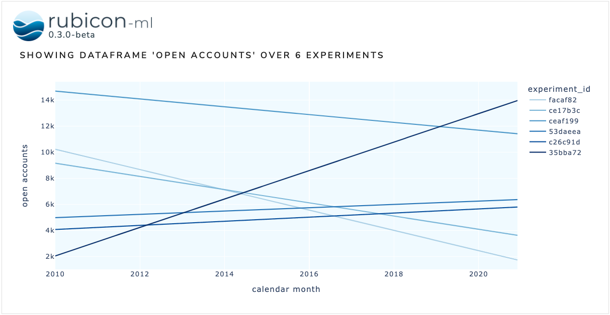
The dataframe plot is used to visualize data logged across multiple experiments as dataframes on a single plot. The dataframes logged to each experiment must have matching schema in order to properly visualize them.
[1]:
import random

import numpy as np
import pandas as pd
import plotly.express as px

from rubicon_ml import Rubicon
from rubicon_ml.viz import DataframePlot
First, we’ll create a few experiments and log a dataframe to each one.
[2]:
DISPLAY_DFS = False

rubicon = Rubicon(persistence="memory", auto_git_enabled=True)
project = rubicon.get_or_create_project("plot comparison")

num_experiments_to_log = 6
data_ranges = [
    (random.randint(0, 15000), random.randint(0, 15000))
    for _ in range(num_experiments_to_log)
]
dates = pd.date_range(start="1/1/2010", end="12/1/2020", freq="MS")

for start, stop in data_ranges:
    data = np.array([list(dates), np.linspace(start, stop, len(dates))])
    data_df = pd.DataFrame.from_records(
        data.T,
        columns=["calendar month", "open accounts"],
    )

    dataframe = project.log_experiment().log_dataframe(data_df, name="open accounts")

    if DISPLAY_DFS:
        print(f"dataframe {dataframe.id}")
        display(data_df.head())
Now, we can instantiate the DataframePlot object with the experiments we just logged. We also need to provide the name of the dataframe we’re plotting. Optionally, provide a Plotly express plotting function as plotting_func to visualize the dataframes with any of Plotly express’ available options.
More on the available Plotly express visualizations can be found in the Plotly express documentation.
We can view the plot right in the notebook with show. The Dash application itself will be running on http://127.0.0.1:8050/ when running locally. Use the serve command to launch the server directly without rendering the widget in the current Python interpreter.
[3]:
DataframePlot(
    experiments=project.experiments(),
    dataframe_name="open accounts",
    x="calendar month",
    y="open accounts",
    plotting_func=px.line,
).show()
Dash is running on http://127.0.0.1:8050/
