View this notebook on GitHub or run it yourself on Binder!
Metric Lists Comparison
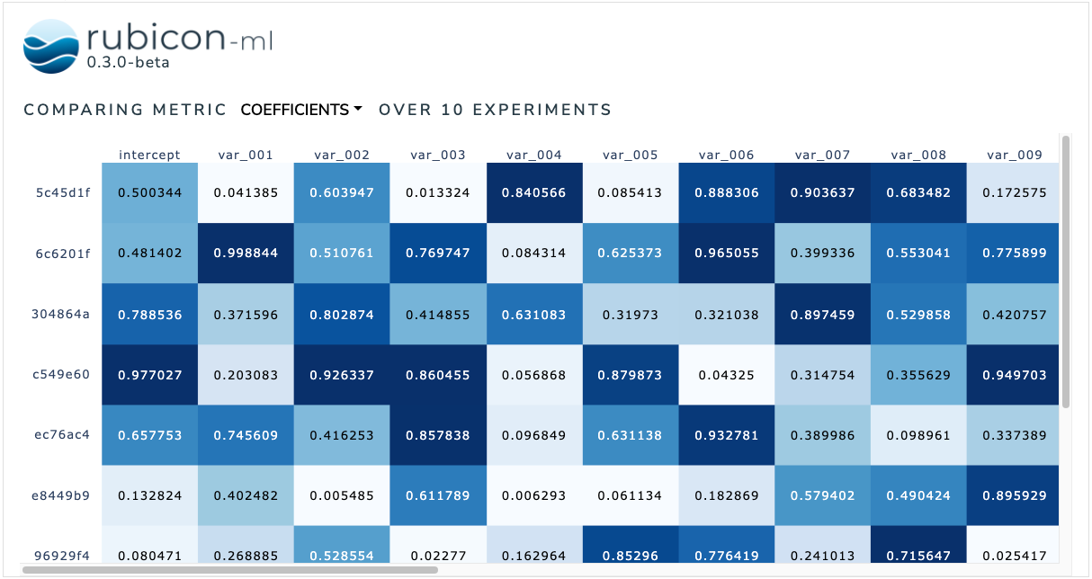
The metric lists comparison is used to facilitate element-wise comparisons between metrics logged as lists. Users can dynamically choose between available list metrics to visualize.
The plot itself is a Plotly annotated heatmap. More information can be found in the Plotly documentation.
[1]:
import random

from rubicon_ml import Rubicon
from rubicon_ml.viz import MetricListsComparison
First, we’ll create a few experiments and log some list metrics to them.
[2]:
rubicon = Rubicon(persistence="memory", auto_git_enabled=True)
project = rubicon.get_or_create_project("list metric comparison")

for i in range(0, 10):
    experiment = project.log_experiment()
    experiment.log_metric(
        name="coefficients",
        value=[random.random() for _ in range(0, 25)],
    )
    experiment.log_metric(
        name="p-values",
        value=[random.random() for _ in range(0, 25)],
    )
    experiment.log_metric(
        name="stderr",
        value=[random.random() for _ in range(0, 25)],
    )
Now, we can instantiate the MetricListsComparison object with the experiments we just logged. Optionally, provide a list of column names as column_names to add the names as a header to each column in the visualization.
We can view the plot right in the notebook with show. The Dash application itself will be running on http://127.0.0.1:8050/ when running locally. Use the serve command to launch the server directly without rendering the widget in the current Python interpreter.
[3]:
MetricListsComparison(
    experiments=project.experiments(),
    column_names=["intercept"] + [f"var_{i:03}" for i in range(1, 25)],
).show()
Dash is running on http://127.0.0.1:8050/