View this notebook on GitHub or run it yourself on Binder!
Metric Correlation Plot
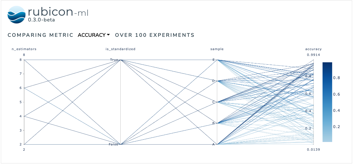
The metric correlation plot is used to compare how various input parameters effect a selected output metric across a number of experiments. Users can dynamically choose between available metrics to anchor the visualization on and rearrange and highlight the plot as desired.
The plot itself is a Plotly parallel coordinates plot. More information can be found in the Plotly documentation.
[1]:
import random

from rubicon_ml import Rubicon
from rubicon_ml.viz import MetricCorrelationPlot
First, we’ll create a few experiments and log some parameters and metrics to them.
[2]:
rubicon = Rubicon(persistence="memory", auto_git_enabled=True)
project = rubicon.get_or_create_project("metric correlation plot")

for i in range(0, 100):
    experiment = project.log_experiment()

    experiment.log_parameter(
        name="is_standardized",
        value=random.choice([True, False]),
    )
    experiment.log_parameter(name="n_estimators", value=random.randrange(2, 10, 2))
    experiment.log_parameter(
        name="sample",
        value=random.choice(["A", "B", "C", "D", "E"]),
    )

    experiment.log_metric(name="accuracy", value=random.random())
    experiment.log_metric(name="confidence", value=random.random())
Now, we can instantiate the MetricCorrelationPlot object with the experiments we just logged and view the plot right in the notebook with show. The Dash application itself will be running on http://127.0.0.1:8050/ when running locally. Use the serve command to launch the server directly without rendering the widget in the current Python interpreter.
[3]:
MetricCorrelationPlot(
    experiments=project.experiments(),
    selected_metric="accuracy",
).show()
Dash is running on http://127.0.0.1:8050/