View this notebook on GitHub or run it yourself on Binder!
Dashboard
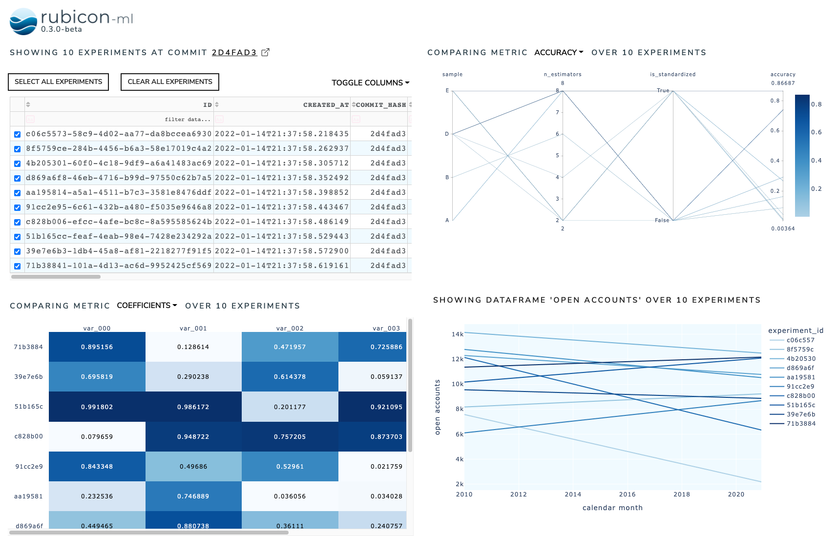
The dashboard is used to combine multiple rubicon_ml widgets into a sigle, interactive dashboard. When a rubicon_ml.viz.ExperimentsTable is present in the dashboard, it acts as a controller to select the experiments visible in the other widgets in the dashboard.
[1]:
import random

import numpy as np
import pandas as pd

from rubicon_ml import Rubicon
from rubicon_ml.viz import (
    DataframePlot,
    ExperimentsTable,
    MetricCorrelationPlot,
    MetricListsComparison,
)
from rubicon_ml.viz.dashboard import Dashboard
First, we’ll create a few experiments and populate them full of parameters, metrics, and dataframes.
[2]:
dates = pd.date_range(start="1/1/2010", end="12/1/2020", freq="MS")

rubicon = Rubicon(persistence="memory", auto_git_enabled=True)
project = rubicon.get_or_create_project("dashboard composition")

for i in range(0, 10):
    experiment = project.log_experiment()

    experiment.log_parameter(
        name="is_standardized",
        value=random.choice([True, False]),
    )
    experiment.log_parameter(name="n_estimators", value=random.randrange(2, 10, 2))
    experiment.log_parameter(
        name="sample",
        value=random.choice(["A", "B", "C", "D", "E"]),
    )

    experiment.log_metric(name="accuracy", value=random.random())
    experiment.log_metric(name="confidence", value=random.random())

    experiment.log_metric(
        name="coefficients",
        value=[random.random() for _ in range(0, 5)],
    )
    experiment.log_metric(
        name="stderr",
        value=[random.random() for _ in range(0, 5)],
    )

    data = np.array(
        [
            list(dates),
            np.linspace(random.randint(0, 15000), random.randint(0, 15000), len(dates))
        ]
    )
    data_df = pd.DataFrame.from_records(
        data.T,
        columns=["calendar month", "open accounts"],
    )

    experiment.log_dataframe(data_df, name="open accounts")
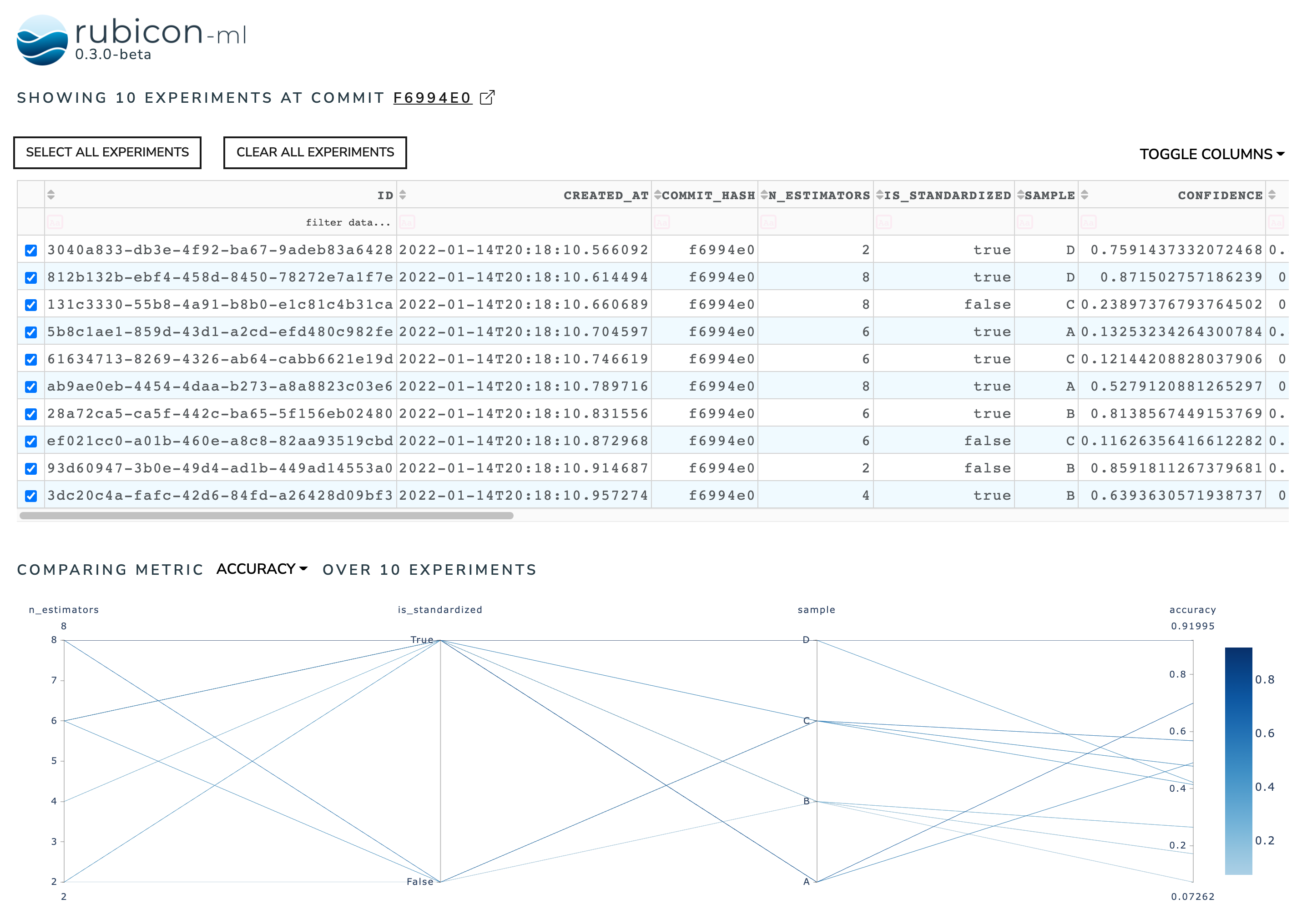
Now, we can instantiate the Dashboard object with the experiments we just logged. By default, the dashboard will have an ExperimentsTable stacked on top of a MetricCorrelationPlot. Selecting an experiment in the experiments table will render it on the metric correlation plot.
We can view the dashboard right in the notebook with show. The Dash application itself will be running on http://127.0.0.1:8050/ when running locally. Use the serve command to launch the server directly without rendering the widget in the current Python interpreter.
[3]:
default_dashbaord = Dashboard(experiments=project.experiments())
default_dashbaord.show()
Dash is running on http://127.0.0.1:8050/
To customize a dashboard, we can pass in the widgets we want rendered. Arguments to widgets should be a list of lists of instantiated rubicon_ml widgets. Each inner list represents a row in the rendered dashboard. Note that the internal widgets are not instantiated with experiments. We provide the experiments to the dashboard itself so each widget shares the same experiments.
Again, we can use show to see our four rubicon_ml widgets arranged into a 2x2 dashboard.
[4]:
Dashboard(
    experiments=project.experiments(),
    widgets=[
        [
            ExperimentsTable(is_selectable=True),
            MetricCorrelationPlot(selected_metric="accuracy"),
        ],
        [

            MetricListsComparison(column_names=[f"var_00{i}" for i in range(0, 5)]),
            DataframePlot(dataframe_name="open accounts"),
        ],
    ],
).show()
Dash is running on http://127.0.0.1:8051/